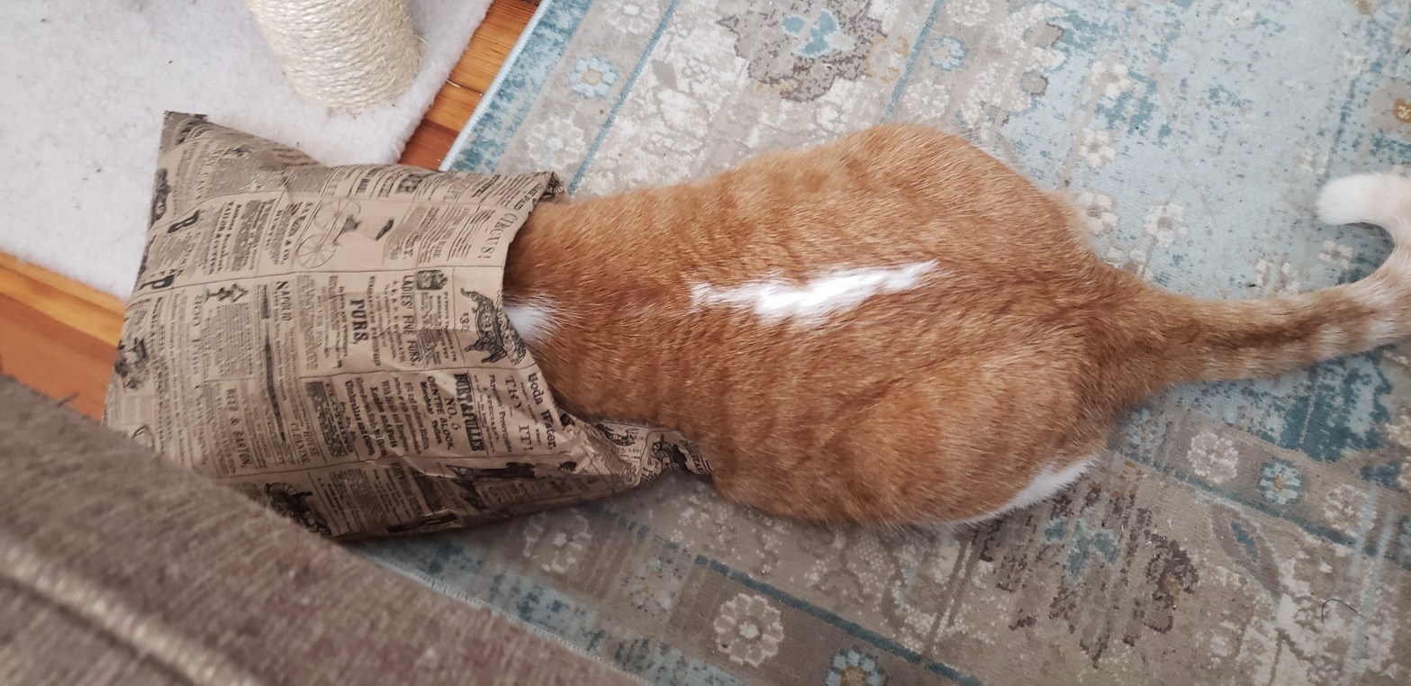
As an editor, the most frequent request I get from staff is to cut text or make text fit into a smaller space. Sometimes this is easy. Sometimes it’s more like my cat Teddy trying to force himself into this little paper bag.
Let’s say you have two and a half pages of text that need to be presented as a two-pager. How can you make this impossible-seeming task feasible?
Below are some tips and tricks for cutting unnecessary text and fitting larger amounts into smaller spaces.
Shortened Words or Phrases
The best text to remove is all those extra words and letters you’re using to convey your thoughts. Believe it or not, more words do not necessarily make a statement clearer. And, often the longer version is not even grammatically correct.
The table below includes the most common instances in which a shorter word or phrase would be just as good as, if not better than, the original.
Remember to take into account the meaning of each phrase, sentence, and paragraph. Do not cut words or letters that could change the meaning of the text (unless that’s your intent).

Is it Needed?
A big part of editing is determining what words or phrases are needed to convey the idea or point clearly but concisely.
Unneeded Words
While editing down your work, ask yourself: Could I get my point across with fewer words? If your answer is yes, cut as many words as possible to the threshold of where your point is no longer clear. Edit down your text in the following order. You can shorten many of these, as in the list above, and some you can delete.
- First examine prepositions (e.g., of, for, to, until, with) and conjunctions (e.g., and, because, but, if, when).
- Next examine adverbs (words that modify verbs, e.g., walking *slowly*) and adjectives (words that modify nouns, e.g., *state-of-the-art* program).
- Cut nouns and verbs last, if at all.
Unneeded Capitalization
Capitalizing the first letter of nearly every noun seems to be convention in many fields, specifically international development, but it’s rarely necessary. And, capital letters take up more space than lower case letters–compare “D” to “d” or “O” to “o.” So, before you capitalize that term or phrase, ask yourself if it’s really necessary.
When should you capitalize terms? Different style books have different rules, but as a general rule only capitalize:
- Names of people, organizations, government agencies, political divisions (countries, states, regions, cities), land formations (mountains, rivers, lakes, seas), monuments, and published works (books, magazines, newspapers)
- Names of donor-funded projects, programs, and initiatives
- Titles used directly before names (e.g., Country Director Jane Doe), not titles used after or instead of names (e.g., Jane Doe is the country director)
- The first letter in a sentence or bullet point
Formatting Tricks
When you have no text left to cut without changing meaning but still need to fit text into a smaller space, use the following tried and true formatting tips. These work in every document creation software, including Word, PowerPoint, and InDesign.
Justified Alignment
Most, if not all, writing applications default to left alignment, meaning that when you type, the letters emanate from the left-most margin and keep on the line until you can no longer fit any more letters, at which point a new line begins. Each letter, number, and symbol takes up a set amount of space in a line of text. Justified alignment, which results in clean, uniform edges along the right and left margins, plays with that set amount of space to get the maximum number of characters possible onto each line. Sometimes this results in large spaces between words because the last word in the line won’t fit and gets pushed to the next line, which is why you shouldn’t use justified alignment if space isn’t an issue. But, often justified alignment will shrink the amount of space a character takes up to get an extra word on the line, giving you space for more words in the paragraph.
Usually you can choose your preferred alignment at the top of the screen or in the “Home” tab. See the four groups of lines of four different shapes? To choose justified, highlight all the text you want to change, then click on the group of lines that looks like a square with no jagged edges.
Paragraph Spacing
Every document application has a standard amount of space it places in between lines and paragraphs. In MS Word, the default is slightly larger than single spaced with about 2/3 of a line in between paragraphs. While this is great for readability, it’s terrible if you need to save space. So, adjust accordingly. In MS Office applications, go to the “Paragraph” section in the “Home” tab and click on the arrow box to open the paragraph styles menu. Make sure that “spacing above” is set to 0 pt and that “line spacing” is set to single. Adjust “spacing after”–the space that separates one paragraph from the next–as needed. Never go above 12 pt or below 4 pt for paragraphs or above 6 pt for bullets (0 pt is fine for bullets).
One Column, Not Two
Staff often tell me that they think two columns of text is more attractive than one. That may be true, but two columns take up an awful lot of extra space (and are harder for most people to read, especially those with visual impairments). The two columns are separated by extra margin space that leaves less room for text. So, when space is an issue, stick to one column.
Smaller Margins
Standard margins in letter paper are 1.0 inch on the top, bottom, left side, and right side of the page. Try reducing the margins to 0.75 inches, 0.5 inches, or even 0.25 inches if you need to (and are permitted to), but don’t go below 0.25 inches because text or visual elements could be cut off or the printer could refuse to print the document. If you’re using A4 paper, standard margins are 2.5 cm; try reducing the margins anywhere down to 1.0 cm.
Smaller Font
Try reducing the font size, but keep it readable. Because every font is different, I can’t simply tell you to go from 12 point font size to 11 point. Each font has its own standard size for readability. For example, Times New Roman is 12 point, Arial is 10 point, Georgia is 10 point, Calibri is 11 point. Try reducing the font size by 1 or 2 points, but check to make sure the text is still easily readable.
